Joyce Renée Wilkenfeld came to Sedoff Epperson in need of a guiding hand on direction for her new company, hoping that getting the brand started with research and development would better inform her pursuits moving forward. Ultimately, Joyce wanted to create a company for her high-quality accessory designs which included pearl-focused jewelry for women and cute collars for dogs—an unconventional combination. The company is driven by her desire to create unique, non-traditional styles and to create well-made products in a market that is sorely lacking in quality.
Through a thorough dive into Joyce’s desires for the brand, her inspirations, target audience analysis, competitor research, and marketing review, we were able to craft a brand that perfectly aligned with her market and goals.
Services
Branding
Print Design
Marketing Research & Planning
Illustration
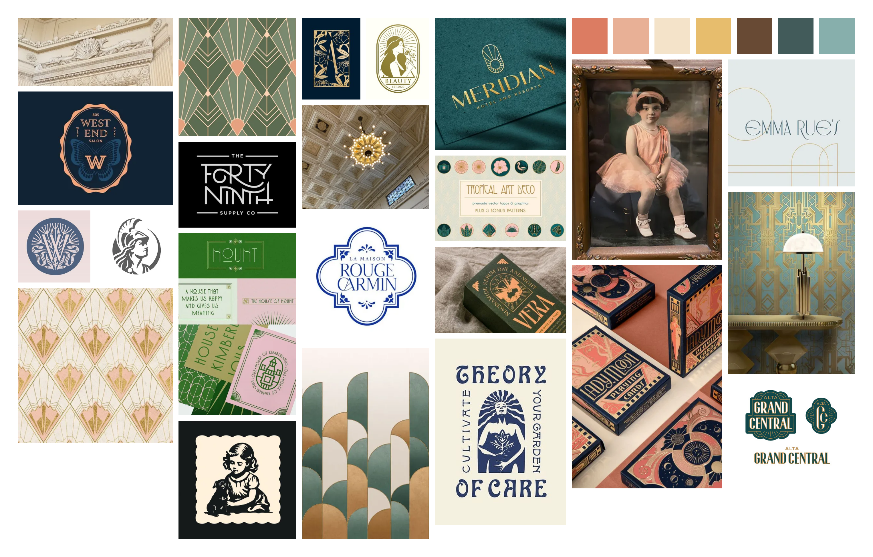
Brand Research
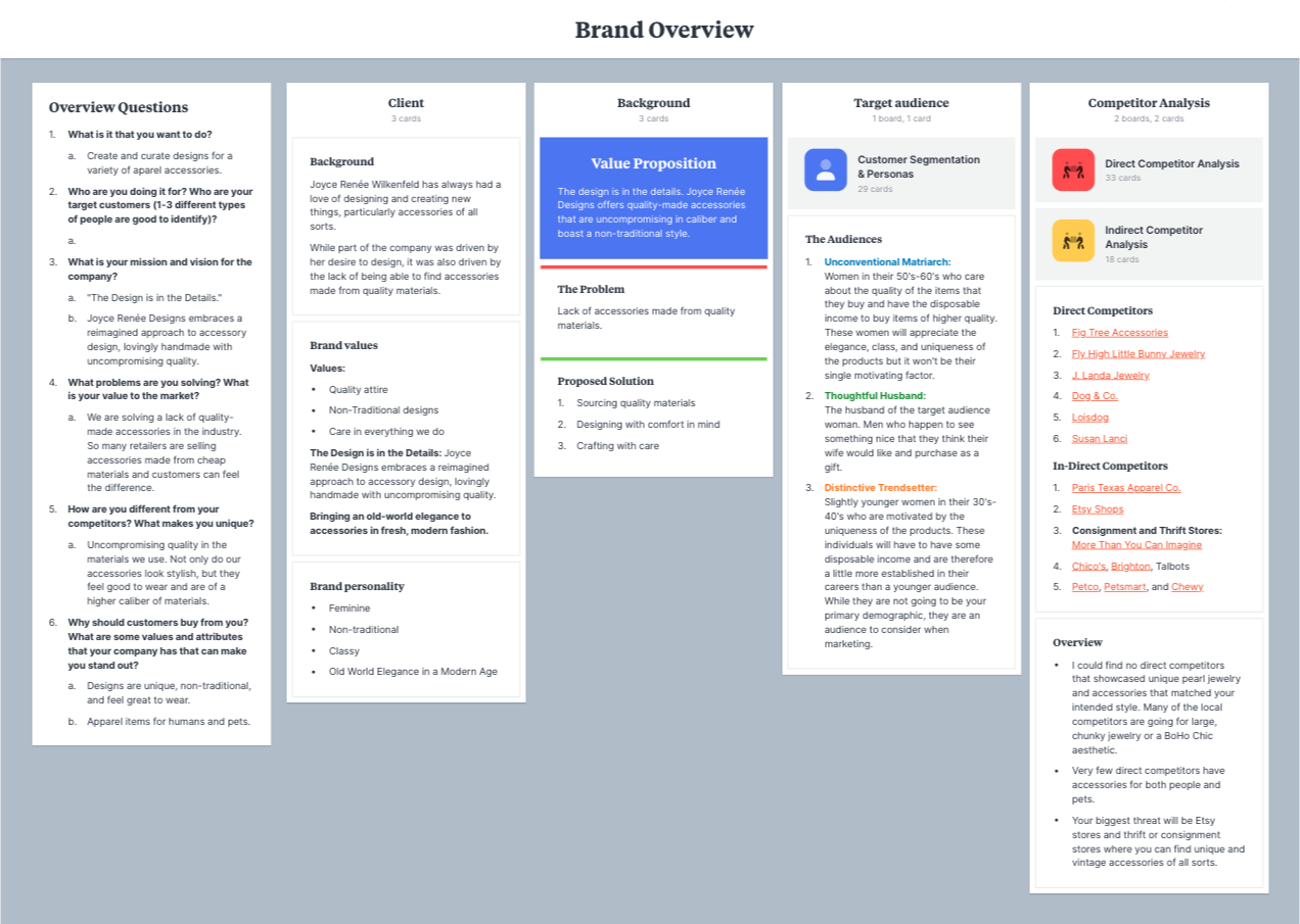
In order to properly develop a brand identity, thorough research into the company and the market needed to be conducted, especially when dealing with a new, un-developed company. As with all Sedoff Epperson brands, we started by holding long discussions with the client to really understand the business, her goals, and the inspiration behind it.
Once we had a firm grasp on the company overview, we dove into market analysis to understand her potential target audience and both direct and indirect competitors.
When discussing inspiration for the company, a few key things came to mind for Joyce. For starters, she originally wanted to name the company after her late aunt, Alva Doris, whose name, “Alva” means “white” and “Doris” means “gift from the sea.” Because she focuses on pearls in her designs, this name perfectly encapsulated the jewelry aspect of the company. She also was inspired by the Chicago Aquarium’s Art Deco architecture and sea motifs throughout. When it was decided that she would be incorporating accessories for dogs as well, she wanted to include the likeness of her dog, Rosie.
This combination of elements lent themselves well to an illustrated logo icon that harkened back to early logo designs of the 1920’s and 30’s, which coincided well with the Art Deco aesthetic that Joyce was looking for.
Final Logo
Illustrated Logo Option Drafts
Final Logo
While two directions for the logo were presented (one of which was an Art Deco Monogram-style logo option with various frames and seashell motifs), Joyce opted for an illustrated logo option due to its personal touch and on-brand personality.
Creative Director, Caitlin Epperson, hand-drew the illustration of Alva Doris and Rosie using Procreate before bringing it into Illustrator to be vectorized.